

What Charts Tell Us – Jan 2017 Update
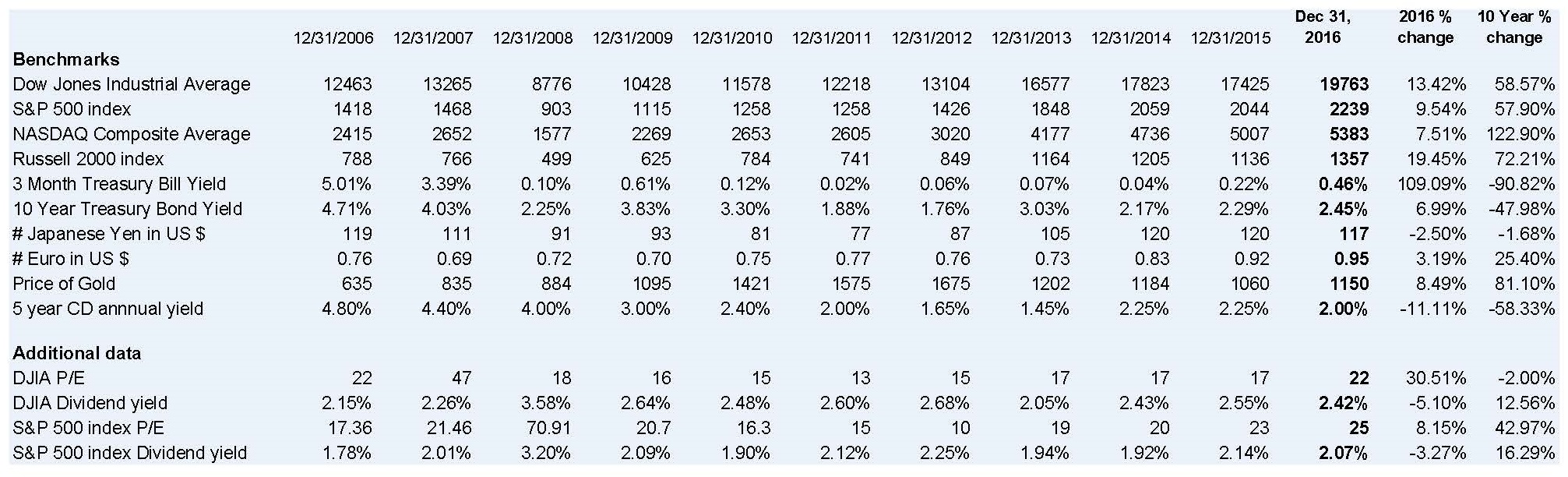
I like preparing and using the year end charts, and find them very helpful when advising clients on long term strategies. After I prepared the charts posted on Jan 5, I thought I would write about the changes but after reviewing them, except for one change, whatever I said in my update blog on January 13, 2015 still applies. You can access it through the archives it if you wish to re-read it. NOTE that I reviewed the chart posted on Jan 5 and made some changes on the S&P 500 PE. I also am showing the PEs rounded but use the two decimals that have been hidden in the file for the calculations, so the percentages might be slightly different than from using the rounded amounts. Further, I am reposting that chart here, and changed it on the original posting.
The one major difference is the increase in the PE ratios of the DJIA and S&P 500. There are many reasons for this and here are some of them.
- The PE represents the end of the year stock value divided by the trailing 12 month earnings. So I took a look at the next year PE estimates. For the DJIA the PE estimate is 18.59 (the 2016 trailing PE was 21.56). For the S&P 500 it is 18.92 compared to 24.82.
- The trailing PE is based on the year end prices divided by the last twelve month’s reported earnings. If there was an upward arc for the year or a strong third and fourth quarter this would indicate a higher projected 2017 earnings making the PE more consistent with prior years.
- Another reason for the high PE could be the anticipation of a corporate tax cut. A drop in the rate from 35% to 20% would result in a direct increase in earnings of 15%.
- Doing some arithmetic applying the tax rate to the current earnings would increase the profits so that the new PE would become about 20. However, please note that many of the large corporations do not pay a 35% corporate tax.
- I am not clear how the reduction of the deferred tax liability would be reported. If as current earnings, this would create a onetime bump up in earnings further reducing the PE.
- Note that there are companies with deferred tax assets rather than liabilities. A rate drop would cause them to have losses – exactly the opposite of what would occur with the reduction of the deferred tax liability.
- If the corporate rate drop spurs business growth there would be still greater profits also dropping the PE.
- High PE ratios signify confidence and optimism while lower ones the opposite. It seems the election of Donald Trump created an aura of confidence driving the market rise.
- Another reason for the high PE could be the drop in profits of a small number of major components of the index. This does not appear to be the case here.
There are other reasons, but I think these provide some insight that using one number as a guide is not sufficient and even when you use any number it needs further understanding and analysis. Also, investing is complicated and thinking that by using a formula or two you can make decisions is not such a sound strategy. Moreover, there are a few “ifs” in what I wrote above and any one can skew the results substantially – in either direction from what you might project.
A “test” of the validity of the stock prices is the dividend yield. This is the year end stock price divided by the previous 12 months cash dividends. These appear consistent with prior years indicating that the stock prices appear reasonable albeit the greater PE than for previous years.
How Can We Help?