

| Beginning | End | 1997-2018 | |||||
| Jan 1 | Dec 31 | Dec 31 | Dec 31 | Dec 31 | Dec 31 | (22 years) | |
| Stock Market Index | 1997 | 1999 | 2000 | 2008 | 2009 | 2018 | growth % |
| Dow Jones Industrial Average | 6448 | 11497 | 10787 | 8776 | 10428 | 23327 | 261.77% |
| S&P 500 Index | 741 | 1469 | 1320 | 903 | 1115 | 2507 | 238.33% |
| NASDAQ Composite Ave. | 1291 | 4069 | 2471 | 1577 | 2269 | 6635 | 413.94% |
| Russell 2000 Index | 363 | 505 | 484 | 499 | 625 | 1349 | 271.63% |
I know that many people do not like to look at numbers, but I want to make a point and using these numbers is the only way I can. However, my discussion is short and sweet. The point I want to make is that graphs and numbers do not always tell the whole story or present the entire picture. However, the charts serve my purposes very well since they reflect the long term trends I want to illustrate to my financial planning clients.
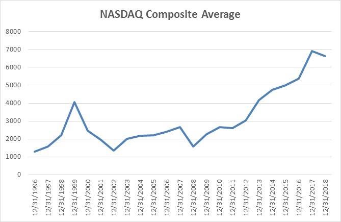
Discussion of NASDAQ Index (Highlighted Above)
The index began 2000 at 4069. On March 10, 2000, the index closed at its all-time high to that point of 5408. That is an increase of 32.9% in less than 2½ months. It then plummeted to end 2000 at 2471. Its downward trend continued to a low point of 1108 on October 10, 2002, but closed that year at 1336. The trends are there, but because of the measurement dates that I used which were the last day of each year, the full extent of the major swings and changes are not indicated.
Looking at the above graph it shows a high point on December 31, 1999, of 4069 while the high point was actually 2½ months later. Using the high of 5408 as the benchmark it took until early 2017 for that index to get back to where it was in 2000. Since then it kept going up until it didn’t at the end of 2018.
The same thing happened in 2009 where these indexes hit low points in March, but those are also not reflected in the charts. As an FYI, the Dow Jones Industrial Average on March 9, 2009, hit its low point of 6509 and from there it catapulted upward. Neither the 2008 or 2009 ending amounts come close to that 6509 amount.
Takeaway
Make sure you understand fully and that the right beginning point and appropriate intervals are used in any data you review.
Additional comment
It appears from the above 22-year record that the growth in three of the four indexes was quite similar. Only the NASDAQ was much different. Also, all of these indexes paid cash dividends during this entire period that are not reflected in the index amounts making the returns greater than shown above, or in the charts posted on January 8, 2019.
Do not hesitate to contact me with any business or financial questions at [email protected] or fill out the form below.
Read More of the Partners’ Network Blog